
.png)
Consumption
Dashboard
Copilot for Security, Microsoft
Creating a usage dashboard for security admins to support a new billing model for Copilot.
Usage transparency
AI tools are easy to use—but managing usage as a billing administrator is tricky once these tools used at scale in an organization.
With a new change to the billing policy, security organizations now get Security Copilot included in their bundle, which means teams can start using AI right away—but it also means usage can quietly grow in the background.
I worked on designing a way for admins to see usage clearly, understand when they’re approaching a limit, and decide what to do next—without surprise costs or confusing setup.
PROCESS SUMMARY
This project ran as a 2-week design sprint across a vertical team. We explored ideas quickly, aligned as a team, and wrapped with a key review with our engineering lead—connecting our design direction back to the original technical vision.

TEAM
Manager — Hayley Steplyk
Product Designers — Amy Zhang, Amelia Koster & Electra Szmukler
Product Manager — Dharini Sundaram
FINAL MVP
Predictability + flexibility
I shaped the dashboard into a clear, end‑to‑end MVP that helps teams see how Security Copilot usage grows over time—and understand exactly where included usage ends and overage begins—before costs become a surprise.
The final experience gives admins a simple, visual way to track usage, understand what’s included, and intentionally opt into pay‑as‑you‑go with guardrails in place.
Usage is shown as a continuous story rather than a set of numbers, with clear signals for approaching limits and a deliberate flow for enabling overage and setting monthly caps. The result is an experience that makes AI usage feel predictable and manageable, even in complex enterprise environments where billing and permissions are split across teams.
BACKGROUND
The value of a dollar
Most AI tools feel infinite. You type something, get an answer, and move on. But in an enterprise setting, AI usage adds up fast. And when money is involved, uncertainty becomes stress.
Teams needed answers to very basic questions:
-
How much are we using?
-
What’s included?
-
What happens if we go over?
The challenge wasn’t just tracking usage—it was making that information feel understandable, calm, and intentional.

Who we designed for
Our primary users were admins, or overseers, and security analysts, or end users —people responsible for security tools, not finance systems.
That meant they:
-
Cared about keeping workflows running
-
Didn’t always control billing or Azure subscriptions
-
Needed clarity more than configuration power
In many organizations, the person watching usage isn’t the same person who can approve spend. So the experience had to work even when users couldn’t take action themselves.

Understanding the journey
We mapped the full story from first exposure to ongoing use:
-
Security Copilot becomes available through M365 E5 licenses
-
Teams start using it naturally
-
Usage grows over time
-
Admins get signals that they’re approaching the limit
-
A decision moment appears: stop, cap, or keep going
Seeing this end‑to‑end helped us focus on the moments that mattered most—especially the point where usage turns into overage.

Making usage visible
As usage grows, teams move through a clear sequence—from included capacity, to approaching limits, to a deliberate decision about overage. Instead of surprising admins with sudden blocks or unexpected costs, the system surfaces clear signals and creates a moment to pause, understand, and choose what happens next.
The challenge
How might we make Security Copilot usage visible and predictable — so teams can confidently decide when and how to move beyond what’s included?
The solution


IN-PRODUCT MESSAGING
Usage messaging by role
This diagram maps the full set of informational messages an E5 customer sees as Security Copilot usage grows—based on whether pay‑as‑you‑go is set up and who is encountering the limit. Instead of assuming a single “happy path,” we designed for real enterprise conditions, where oversight and usage are split across roles.
The experience adapts based on context:
-
Clear warnings as teams approach limits
-
Explicit decision points when included usage runs out
-
Guardrails and guidance when action is required to continue
By accounting for both end‑users and overseers, we ensured usage limits never feel sudden or confusing—only intentional.

THE IMPORTANCE OF CLEAR LANGUAGE
Each node in this flow used real, production‑ready content drafted in partnership with our UX technical writers. Because language and calls to action were critical at these moments, we designed the messaging and actions alongside the flow itself.
Visualizing the alerts
We designed these in‑product messages as a flexible system rather than one‑off notifications. The same message patterns can adapt across different Microsoft Security portals—such as Security Copilot, Defender, Entra, and Purview—while maintaining consistent language, hierarchy, and calls to action.
By separating message intent from page layout, we ensured alerts, warnings, and errors feel familiar wherever they appear, helping users quickly understand what’s happening and what to do next, regardless of the surface they’re in.

Copilot sidecar

Main chat input

Agent page
USAGE DASHBOARD
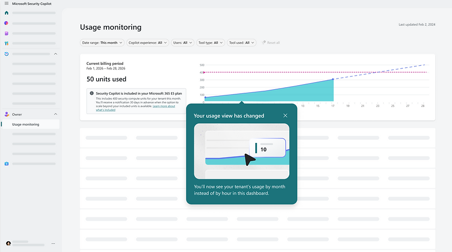
A single source of truth for usage
The usage dashboard gives admins a clear, shared view of how Security Copilot usage is trending over time. Instead of surfacing raw numbers or billing jargon, the dashboard focuses on what matters most: what’s included, how close teams are to the limit, and whether action may be needed soon. This view acts as the foundation for every decision that follows—alerts, in‑product messages, and pay‑as‑you‑go setup—so teams can stay informed without constantly monitoring usage.
To design this dashboard, I looked at many examples of data visualization of a graph over time; for example, cloud storage limits, stock graphs, and many more.
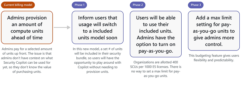
Phase 1: Inform users that inclusion is starting

Phase 2: Included units model has begun, pay-as-you-go possible

Phase 3: Pay-as-you-go has a maximum limit

PAY-AS-YOU-GO
Making overage a conscious choice
Pay‑as‑you‑go is designed as an explicit decision, not a background setting. When included usage runs out, the experience pauses and gives eligible admins the context, controls, and guardrails they need to decide what happens next. By requiring deliberate setup and a clear monthly cap, pay‑as‑you‑go lets teams continue working when they’re ready—without risking unexpected costs or silent spend.
Pay-as-you-go entry point


STORYTELLING
Where design met reality
To close out the sprint, we presented the final MVP flows to our engineering lead, Dorothy, using a focused set of mid‑fidelity slides. The goal of this presentation was not visual polish, but alignment—walking through the full system behavior, key decision points, and edge cases to ensure the design matched technical realities and could scale.
Sharing this work early helped validate assumptions, surface implementation considerations, and confirm that the experience balanced clarity, governance, and feasibility before moving forward.


TAKEAWAYS
Key insights
This project reinforced that usage, limits, and billing are fundamentally UX challenges—especially in enterprise environments where responsibility and control are distributed. By focusing on clear signals, deliberate decision points, and predictable outcomes, we transformed a potentially stressful moment into an understandable and manageable experience.
Designing for real‑world constraints, partnering closely with engineering, and treating content as part of the system helped ensure the final solution was not only usable, but trustworthy and scalable as Security Copilot adoption grows.
USAGE AND BILLING ARE UX PROBLEMS
AI usage limits and cost controls aren’t just backend concerns—they shape how confident users feel using the product. Treating usage, alerts, and pay‑as‑you‑go decisions as first‑class UX moments helped transform a sensitive topic into something understandable, predictable, and manageable for enterprise teams.
CLEAR SIGNALS BUILD TRUST
Instead of relying on hidden limits or sudden blocks, we designed clear, progressive signals that help teams understand what’s happening before action is required. By making thresholds, warnings, and decision points visible, we replaced surprise with clarity—and gave users time to prepare.
DESIGN MUST ACCOUNT FOR REAL-WORLD CONSTRAINTS
Enterprise systems rarely have a single owner. Permissions, billing authority, and usage are often split across roles and teams. Designing for those realities—blocked paths, handoffs, and edge cases—ensured the experience worked even when users couldn’t take action themselves, making the system more resilient and scalable.
Congrats! You made it to the end of this page.
Hope you enjoyed coming along for the ride, and I truly appreciate you taking the time to check out my work! You can reach me at amyzh425@gmail.com — I'd love to chat with you.